Mega Man 11‘s announcement brought me a lot of joy. This is my favorite game series. I’ve loved Mega Man as long as I can remember. Some of my earliest memories involved watching my brother play through the original side-scrollers on the NES.
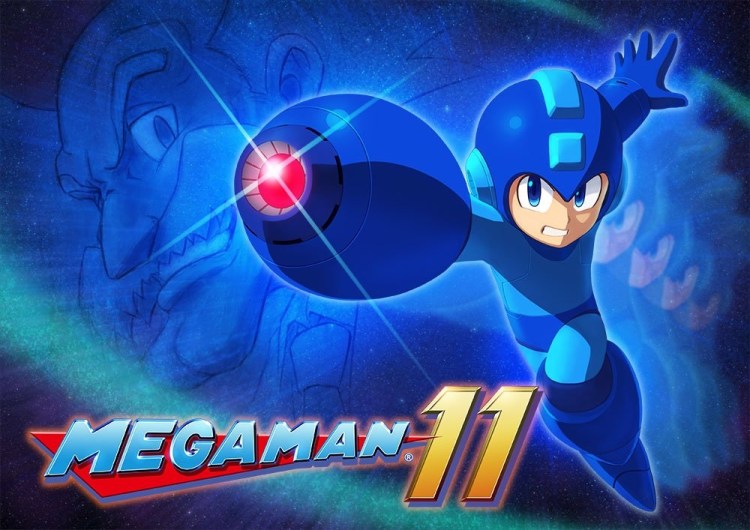
And Mega Man 11 looks great. The debut trailer showed off classic run-‘n’-gun gameplay. But one thing stands out. For the first time, a classic-style Mega Man game is using 3D character models, levels, and backgrounds.
Of course, the action is still in 2D. We’ve seen plenty of these 2.5D games before, including the recent Metroid: Samus Returns and the entire New Super Mario Bros. series. Some people aren’t fans of this style over traditional sprites or hand-drawn art. After seeing the trailer for Mega Man 11, some gamers were quick to criticize its look.
I am here to say that it’s fine.
June 5th: The AI Audit in NYC
Join us next week in NYC to engage with top executive leaders, delving into strategies for auditing AI models to ensure fairness, optimal performance, and ethical compliance across diverse organizations. Secure your attendance for this exclusive invite-only event.
But it’s not fantastic
In fact, it looks pretty good. Do I wish Mega Man 11 was as vibrant as Ori and the Blind Forest? Sure. Would it be nice if Mega Man 11 had hand-drawn art like the recent Wonder Boy: The Dragon’s Trap remake? That would have been nice, too. But I don’t think Mega Man 11’s look deserves ridicule.
The last two entries in the series used nostalgic 8-bit graphics. The effect was magical in Mega Man 9. It already lost some of its luster in Mega Man 10. Doing another 8-bit Mega Man would have felt lazy. It’s an iconic look, but eight of the 10 mainline Mega Man games use it. It’s nice for something new.
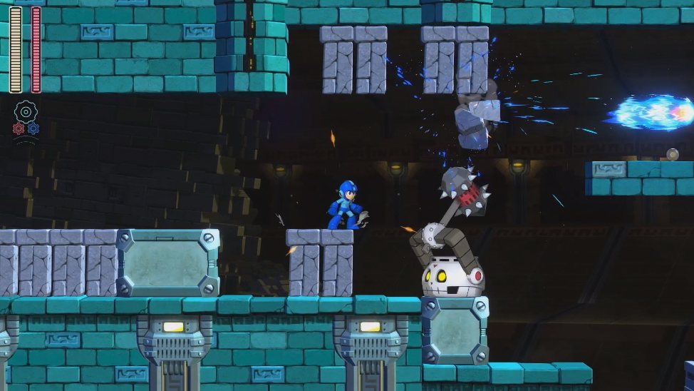
And using 3D graphics in a 2D game does have advantages. It can give backgrounds more depth, something we can see in the opening moments of the trailer with a large bridge bending further into the distance and a towering pyramid looming behind it. It also makes it easier to show more details in characters and add more special effects, like smoke and sparks.
And Capcom is still using colors and designs that evoke classic Mega Man. Everything looks bright, a slight cel-shaded effect helps characters stand out, and the camera is pulled back far enough for as much space around Mega Man as possible (making it easier to dodge projectiles and plan your next jumps).
Above: Mega Man 11 is still colorful.
The reason for the stiffness
I’ve seen people criticize Mega Man’s animation. They say it looks a bit stiff. It does, but I understand why. Unlike other platforming stars, Mega Man has to be able to stop or turn immediately. Mario or Sonic carry over momentum. If you let go of the D-pad, they’ll still move for a bit before stopping. If you’re at a full run and you change directions, they’ll slow down.
Mega Man doesn’t work like that. Because he has to aim weapons, dodge bullets, and jump at the same time, it’s important that his physics feel more precise. This means that you can walk in one direction but turn to the other side and jump with full momentum.
It also means that artists don’t have the opportunity to insert transitional animation frames for things like turning. It might be a little unsightly, but it’s a necessary sacrifice to keep Mega Man’s classic game feel.
No, it’s not the next Mighty No. 9
There’s a big point I want to dispute. Mega Man 11 does not look like the next Might No. 9. That indie side-scroller was supposed to be a spiritual successor to Mega Man that ended up being a big disappointment. It’s also a 2.5D game.
But Mighty No. 9 didn’t suck just because it uses 3D models. It has bad boss design, performance issues (including a lot of framerate problems and slowdown), and annoying voice-overs. And even if we were just to focus on the art, Mega Man 11 still looks better than Mighty No. 9.
Above: Hey, how about you shut up?
Just look at the above shot. The style of the anime character portraits clashes with the realistic steel beams, city, and sky. The player character, Mighty No. 9, doesn’t pop out. It’s actually kind of hard to even see him. Oh, and who could forget the game’s embarrassing fire?
Above: Seriously?
Just look at that. It’s not at all fair to compare Mega Man 11 to this.
I’m not saying that Mega Man 11’s art is brave, awesome, or beautiful. But it works. Besides, Mega Man 11 is going to fail or succeed based on its gameplay. I’m more interested in getting my hands on it and seeing how the controls feel, what the levels are like, and what the bosses can do.
I get that I might be coming off as a defender here. And it’s true that I have a lot of emotional attachment to Mega Man. But I’m not going to let something like 3D character models get in the way of my excitement for the first new game in this series since 2010.
The RetroBeat is a weekly column that looks at gaming’s past, diving into classics, new retro titles, or looking at how old favorites — and their design techniques — inspire today’s market and experiences. If you have any retro-themed projects or scoops you’d like to send my way, please contact me.