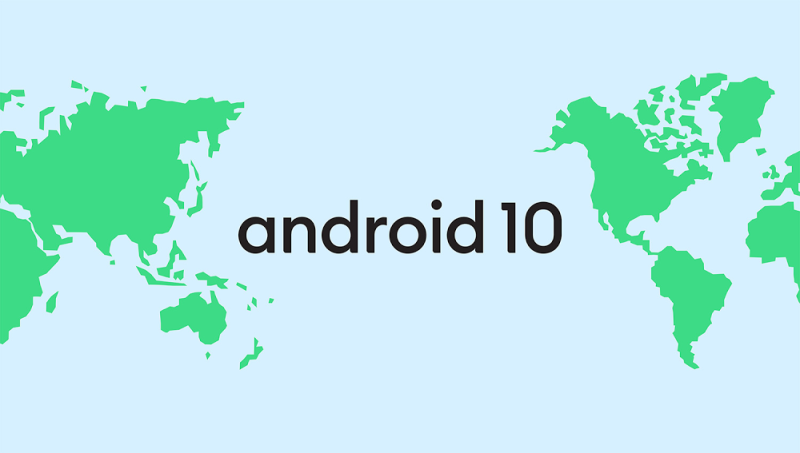
Google’s Android, the operating system that’s now on more than 2.5 billion tablets, cars, watches, TVs, and other active devices around the world, is getting a rebrand intended to make it more “accessible” globally. The Mountain View company this morning revealed a refreshed logo it intends to release in the coming weeks, alongside the official name of what has until this point been referred to as Android Q: Android 10.
“Over the last decade, Android’s open platform has created a thriving community of manufacturers and developers that reach [an] audience with their devices and apps,” wrote Android vice president of product management Sameer Samat. “As we continue to build Android for everyone in the community, our brand should be as inclusive … as possible — and we think we can do better in a few ways.”
Since Android 1.5, Google has named each version of its mobile operating system after a sweet food or dessert, moving sequentially through the letters of the alphabet:
- Android 1.5 Cupcake (April 2009)
- Android 1.6 Donut (September 2009)
- Android 2.0/2.1 Éclair (October 2009, January 2010)
- Android 2.2 Froyo (May 2010)
- Android 2.3 Gingerbread (December 2010)
- Android 3.0/3.1/3.2 Honeycomb (February 2011, May 2011, July 2011)
- Android 4.0 Ice Cream Sandwich (October 2011)
- Android 4.1/4.2/4.3 Jelly Bean (July 2012, November 2012, July 2013)
- Android 4.4 KitKat (October 2013)
- Android 5.0/5.1 Lollipop (November 2014, March 2015)
- Android 6.0 Marshmallow (October 2015)
- Android 7.0/7.1 Nougat (August 2016, December 2016)
- Android 8.0/8.1 Oreo (August 2017, December 2017)
- Android 9.0 Pie (August 2018)
Going forward, the company says it will change the name of Android’s releases to version numbers, starting with Android 10. This is to prevent confusion for new Android users who aren’t familiar with the naming convention, Google asserts, and to better accommodate those in countries where the dominant language doesn’t reflect alphabetic order and where certain treats aren’t commonly eaten as desserts.
June 5th: The AI Audit in NYC
Join us next week in NYC to engage with top executive leaders, delving into strategies for auditing AI models to ensure fairness, optimal performance, and ethical compliance across diverse organizations. Secure your attendance for this exclusive invite-only event.

“We’ve heard feedback over the years that the names weren’t always understood by everyone in the global community,” wrote Samat. “For example, L and R are not distinguishable when spoken in some languages, [so] when some people heard us say Android Lollipop out loud, it wasn’t intuitively clear that it referred to the version after KitKat … As a global operating system, it’s important that these names are clear and relatable for everyone in the world.”
As for the updated logo — Android’s first new look since 2014 — it has swapped the color green for black and gained a new set of high-contrast combinations, which Google says should make it easier for people with visual impairments to read. “It’s a small change, but we found the green was hard to read,” explained Samat.
For the uninitiated, Android’s visual branding is inspired by the operating system’s official mascot: Bugdroid — the work of Irina Blok, who while a designer at Google pitched the now-familiar stripped-down robot with a tin-can-shaped torso and antennas on his head.
