
Apple’s latest Mac operating system — OS X 10.7, codenamed Lion — has finally come out. It’s designed to invoke the same kind of lightweight hands-on feel the iPhone operating system, iOS, has made popular. With just about every computer carrying a multi-touch trackpad, that should be pretty straightforward.
Right?
Well, not quite. After spending some time with OS X Lion, I get the impression that Apple made a lot of unnecessary changes to add a layer of gloss to the operating system. It’s trying hard to be like the iPhone, but at the end of the day it feels like a Mac with iOS features hastily duct-taped to the surface. And the tape peels away rather quickly when you try to stress-test each application.
June 5th: The AI Audit in NYC
Join us next week in NYC to engage with top executive leaders, delving into strategies for auditing AI models to ensure fairness, optimal performance, and ethical compliance across diverse organizations. Secure your attendance for this exclusive invite-only event.
The new operating system boasts more than 250 new changes, with a lot of that happening under the hood thanks to the operating system’s transition from Carbon to Cocoa. Most of the new features, like the Launchpad and Mission Control, in the operating system are inspired by the iPhone operating system. Lion is in some ways the end of an era for the Mac OS X operating system, as the company transitions to a more lightweight operating system like iOS.
I’m just not sure if that’s a good thing yet.
Scrolling
Let’s start with the first thing you’ve probably heard about Lion: Scrolling is backwards. That is, when you use two fingers on the trackpad to make the current window scroll up and down, the window moves in the opposite direction as it did in previous versions.
In Snow Leopard, windows scroll up when your fingers move down, as if the trackpad were a wheel rolling against the window. In Lion, windows scroll down when your fingers move down, as if the trackpad were a virtual part of the window. It’s more iOS-like, and arguably more logical. But it will take some getting used to.
I tried using it for an evening, and I wasn’t a fan. Fortunately, you can turn it off in System Preferences.
Spaces and Mission Control

The largest change is the addition of “Mission Control,” which replaces the old Exposé feature in Snow Leopard. OS X originally featured a way to quickly page through four separate versions of a desktop laid out on a virtual grid. Mission Control lets you add an unlimited number of new desktops — called Spaces — that you can access through a similar fashion. One quick hand gesture lets you quickly view every Space you currently have open.
The unlimited number of desktops is important because a lot of the apps are now designed to run in full screen mode. I know personally I used to reserve one or two spaces for specific apps, such as Mail, so the new way of doing it felt more or less natural. Instead of having a space reserved for a windowed app, it’s a full screen app. It’s an elegant solution for cutting down clutter on your screen.
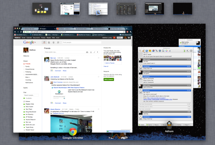
Only a few native applications currently support the full screen feature, and it doesn’t work for every app. Chrome, for example, supports a full screen mode, but because it isn’t yet native for Lion, it doesn’t work quite the same as other full screen apps. The operating system still reserves one “main” space that takes up a majority of the screen when you want to browse through all your spaces at once, which is useful for apps that are designed to be used simultaneously — such as a chat app and a web browser.
Switching spaces isn’t as pleasant an experience as it was in Snow Leopard. The transitions in the old operating system were smooth, compared to the jerky jumps in Lion. Icons on your desktop also re-render for each new space, which feels pretty weird. Snow Leopard had the advantage of letting you jump to a specific space with a single keystroke, thanks to the grid-style layout. With Lion, you have to page left and right between spaces, so a lot of time is spent jumping over unused or less frequently used spaces.
The main Mission Control screen helps circumvent that, but it still feels slower than the old way of accessing a space in Snow Leopard, which was basically a single keystroke.
Launchpad and Apps
 Finding apps can be a touch difficult for newbies in prior versions OS X. Apps either show up in the dock on the side of the screen, or you have to dig through the Mac’s file browser, the Finder, to get to the Apps folder and launch a program.
Enter Launchpad, Lion’s simplified spot to launch applications. Like many other aspects of Lion, it feels like the iPhone operating system.
Lion automatically lays out your applications in a grid that you can access with a gesture or by dragging your mouse to a corner of the screen. The first page of the Launchpad is reserved for Apple native apps, and then the rest of the pages are populated by apps you personally install.
It was frustrating at first when I tried to access Chrome, only to find that my most-used app on the computer was excluded from the first page. Luckily, you can re-order the launchpad to suit your needs, but I wish the operating system could automatically handle organization to make my most-used apps more accessible.
 It’s a problem because the Launchpad is populated with every app on my system. That means that while I have an icon for Gimp, an open-source photo-editing client, I also have an icon for all the extra video codecs, Silverlight, uninstaller programs and a whole lot of other things I will never use. They clutter the Launchpad and are a pain to remove (which took a little bit of time to figure out.)
It feels like the Launchpad is, and will be, useful, but the whole process of re-configuring it took out a little chunk of time and left a bad taste in my mouth as part of the whole experience. Luckily, you can ignore the whole experience my turning off the gesture and the corner access, and going back to the old Dock- and Finder-based way of launching apps.
App Makeovers
 Three of Apple’s basic applications received serious redesigns in Lion. The Mail App now features a three-column display similar to the iPad, while Contacts and iCal — the Mac’s native calendar app — received face-lifts.
The mail redesign is sensible, but it has slowed the app down a little bit. In the old Mail App, I could quickly page through more than a hundred emails in the span of a few minutes and have each of them register as read. With the new app, I have to sit on a single message for around a second and a half before it is registered as read. I’m pretty nitpicky about this because I prefer to have an empty inbox whenever possible, so even that minor delay is annoying.
But the address book and the calendar apps are writing checks the OS X design can’t cash. In Leopard, both apps were very easy to quickly access and edit and they weren’t flashy. In Lion, the new apps received a visual face lift and now feel more garish than anything else when compared to the typical minimalist feel of OS X.
The calendar app still retains a slightly similar feel to its predecessor, and it works well as a full screen application. But the change to the design of the app feels unnecessary and is more disorienting than anything else. It’s pretty clear that Apple is trying to evoke an iPhone-like feel for the calendar, but it falls short of even that — the iOS calendar app is also minimalist, like the Mac calendar app’s predecessor.
Documents and Versions
 TextEdit, the document editing tool built into OS X, has also received a makeover. That change is pretty welcome, because it even finds a way to be more minimalist and accessible than the last version. The new app adds more formatting features to the top bar, but the biggest change in the app is versioning.
Whenever you make a change to a document, you save it as a “version” rather than overwriting the old file completely. Lion saves the changes to the document, rather than the full document, so in theory it shouldn’t take up an enormous amount of disk space no matter how many revisions you make. When you want to browse old versions, the document app jumps to a full-screen view that shows two versions side-by-side.
That’s a great idea — in theory. But the full-screen view is also populated with an obnoxious animated background of moving stars in space that is distracting. It would make more sense to just open up a second version of a document and display it without having to feel flashy.
Aesthetics
You’ll quickly notice a few subtle things have changed about the way Apple displays windows. The most obvious aesthetic change is the scroll bar for a window. What was once a sugar-coated shiny piece of candy of a scroll bar is now a subtle gray bar that disappears when it isn’t in use in native apps. It evokes the same feel the iPhone operating system has. That makes sense of a 3.5-inch screen, because real estate is a premium. For Lion, it works, but doesn’t add a whole lot to the experience.
The rounded, bold blues of the Aqua user interface are now more subdued and considerably less shiny. Most rounded-style buttons and radio buttons have been replaced with a duller, more minimalist hue. It actually feels more welcome than any of the other design changes, because it gets another part of the operating system out of the way of the user and lets them focus on the experience of an app or a web browser.
The Finder has also picked up a redesign, with the bright and colorful icons replaced with a monochrome gray set that homogenizes the sidebar. You can switch icons in the Finder to a cover-flow style display that lets you flick through them quickly with a finger gesture.
Speed — or lack thereof

It feels like Lion is missing a level of polish that is typically present with the company’s other operating systems. Snow Leopard felt crisp and the installation was smooth as silk (it even showed off a little by shrinking the size of the operating system on your hard disk.) More than anything else, my Mac felt faster after the Snow Leopard installation.
Lion, by contrast, has added a layer of sluggishness to my day. Whether it’s nitpicky little concerns like having to page through multiple spaces or the frequent times the operating system has borked and left my computer hanging for upwards of 30 seconds, it’s frustrating. It’s even more frustrating when I’m on a deadline and I feel like I have to fight with the operating system to get it to work.
I have never had more issues installing and initially running an operating system than I have had with Lion. The Launchpad, Mission Control and a whole host of other goodies introduced in Lion have occasionally left my Mac hanging with little recourse other than to restart the thing. It feels like Apple has made a lot of changes that were unnecessary, and those changes have slowed down the operating system considerably.
The app is available for $29 on the Mac App Store. It’s hard to argue against an upgrade simply because Apple will inevitably address user concerns in future updates. But at the end of the day, I can’t help but feel like I want to switch back to Snow Leopard.