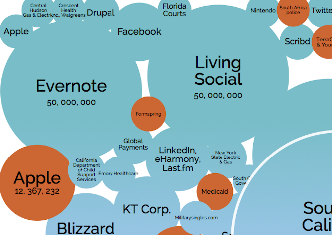
If you didn’t believe us that hackers have been keeping themselves really busy in the last few years, this interactive graphic might just be the visual proof you need.
David McCandless of Information is Beautiful created the graphic with coder Tom Evans. It shows all the different “data breaches” that have occurred since 2004 affecting more than 30,000 people. Each attack is displayed as a bubble, based on that victim-count. You can also filter by year, method of leak, what was stolen, and the type of organization.
Pretty much any article about a hack you might read includes some mention of how “cyberattacks are growing,” and “the amount of hacks have increased in the last X amount of years.” This graphic gives those call-outs merit, but also highlights some of the internal mistakes companies have made that let regular folks accidentally leak out data (see: Facebook).
As you scroll up from 2004, the size of the breaches actually seem to diminish slightly, but the frequency definitely increases and varies from hundreds of thousands to tens of millions of victims. You can click on each bubble to get a little more information about the breach and click through to a report.
June 5th: The AI Audit in NYC
Join us next week in NYC to engage with top executive leaders, delving into strategies for auditing AI models to ensure fairness, optimal performance, and ethical compliance across diverse organizations. Secure your attendance for this exclusive invite-only event.
Check it out and let us know what you think of the interactive graphic.
