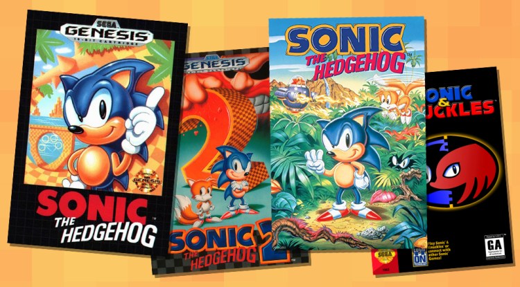
I bought a refrigerator magnet last week that has the box art for the original Sonic the Hedgehog, the one that came out for the Sega Genesis back in 1991. Not to sound like a crazy person who just stands in front of his fridge all day, but I’ve spent a lot of time staring at that magnet.
It’s just so beautiful, and it had me thinking about some of the other covers for those classic Sonic games for the Genesis. So I thought it would be fun to go through them all and talk about why they rule — well, most of them.
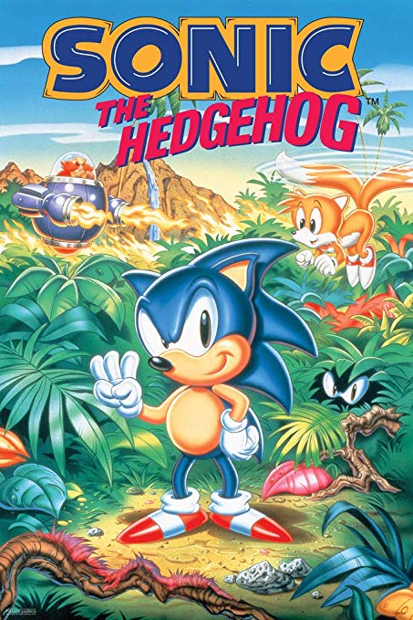
Sonic the Hedgehog

Above: Sonic the Hedgehog.
Man, this is great. This may still be my favorite rendition of Sonic. He has that smirk and pose that conveys a bit of that ’90s attitude the character became famous for, but he still has appealing, round features that make him kind of cute and likable. Also, the shading is so great. I could just stare at that tummy lighting gradient for hours. OK, that’s ridiculous, but I could do it for like a few minutes straight, which is an impressive amount of time to look at a cartoon stomach.
That background does so much to sell the game too. It shows off one of the most exciting feature’s from Sonic’s levels: the loops. We even have those rings glistening in the background, and the hint of green on the edges does a wonderful job or framing the image.
June 5th: The AI Audit in NYC
Join us next week in NYC to engage with top executive leaders, delving into strategies for auditing AI models to ensure fairness, optimal performance, and ethical compliance across diverse organizations. Secure your attendance for this exclusive invite-only event.
I’m also a big fan of box art that uses a border. A lot of Capcom and Konami games from the NES era did a similar thing, and for some reason it has always looked so attractive.
Sonic the Hedgehog 2

Above: Sonic the Hedgehog 2.
Oh, baby! Now this is how you do box art for a sequel. While the original game put Sonic himself front and center, this one gets a bit creative and frames everything around this giant 2. But because of the use of the series’ iconic font and checkerboard texture, we still strongly identify it as Sonic.
Then you have Dr. Robotnik looming in the background, towering over our heroes as he crushes that 2. The cover also does a good job of introducing Tails, proudly displaying him next to our beloved Sonic. We also still have that border I love so much, even if it is a bit smaller.
I do have some small criticisms. This rendition of Sonic isn’t as strong as the one in the original. His posture is weird, especially the way he’s bending his knees. The shadows are also a bit off. According to where the light is coming from based on the shadows coming off of Sonic and Tails, that giant 2 should be casting a much bigger one that what we’re seeing.
Sonic the Hedgehog 3
Above: Sonic the Hedgehog 3.
And then we have the box art for Sonic the Hedgehog 3, which I like significantly less than its predecessors. It’s just so busy. The foliage and other details of the jungle overtake too much of the characters and action instead of helping to frame them. It also does a poor job of introducing Knuckles, the major new character in this game. He’s hiding in a bush as if his existence is some kind of a secret, even though he shows in the game’s intro.
Tails and Dr. Robotnik just kind of float around the background. Robotnik looks far less menacing than he does in the Sonic 2 art. Sonic himself also retains his poor posture from Sonic 2. In fact, this render of Sonic looks so similar to the last one that it almost feels like they copy/pasted it and then changed his arms. Also, him holding up the three fingers is goofy and uninspired. Oh, and Sonic’s shadow makes no sense.
We also lost that dark border completely now, which is the biggest aesthetic crime here
Sonic & Knuckles

Above: Sonic & Knuckles.
After that overly busy cover for Sonic 3, Sonic & Knuckles goes for something a good deal simpler. I like it! That emblem tells you everything you need to know. It’s Sonic and Knuckles. You even have those interlocking blue and black backgrounds to hint at the cartridge’s lock-on functionality.
Sadly, the bottom part of the box is dedicated to explaining that feature in full detail. That’s probably helpful information, but it doesn’t do much for the aesthetics of the cover.
This box reminds me of that iconic VHS cover for Tim Burton’s Batman movie, which was just the Batman emblem on a black background. That one was even so bold that it didn’t include the word Batman. It would have been cool to see a version of this box that went with a similar approach, even getting rid of the title to just feature that beautiful emblem.
OK, that’s it for my box art ramblings. If this is something you’d like to see me talk more about, let me know! There are still a lot of awesome retro gaming covers out there to talk about.
The RetroBeat is a weekly column that looks at gaming’s past, diving into classics, new retro titles, or looking at how old favorites — and their design techniques — inspire today’s market and experiences. If you have any retro-themed projects or scoops you’d like to send my way, please contact me.