 Facebook is testing out a new few tweaks thats make the news feed more visual. A screenshot from Hotlou shows that three larger images appear at the top of the news feed, leading into friends’ photo albums that are popular.
Underneath are tiny icons allowing users to like or comment on the albums.
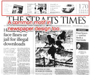
What’s interesting is that the new photos almost resemble promos or “skyboxes” that become popular on the top of newspaper front pages in the 1980s, as computer graphics software allowed designers more flexibility and gave rise to modular design.
When Facebook started brainstorming the original concept for the news feed more than four years ago, its engineers looked toward the past to come up with designs for how its users would consume information.
June 5th: The AI Audit in NYC
Join us next week in NYC to engage with top executive leaders, delving into strategies for auditing AI models to ensure fairness, optimal performance, and ethical compliance across diverse organizations. Secure your attendance for this exclusive invite-only event.
 One of those designs was the trusty old newspaper.
The news feed was conceived of as a personalized newspaper for users with a constant stream of stories from friends, said Chris Cox, Facebook’s vice president of product last fall at a conference.
When we started working on the news feed, we had a metaphor of the newspaper. It was a way to pull in a bunch of sources and find what the reader found interesting. But it wasn’t just the newspaper, because that wouldn’t fully work.
We really focused on trying to think about what you tell people first when you talk about a day or week. You focus on the important things first. It’s the right balance between a newspaper and a stream. It’s a big problem for all of us.
With these subtle changes, it looks like Facebook might be tipping its balance toward the newspaper and away from the stream.
